
box-shadow
box-shadow可以设置六个属性:
inset
边框内阴影
offset-x
水平偏移量,负数为左边阴影
offset-y
垂直偏移量,负数为上边阴影
blur-radius
模糊半径
spread-radius
取正值时,阴影扩大;取负值时,阴影收缩。默认为0,此时阴影与元素同样大。
可以利用spread-radius 为offset-x | offset-y 相同像素的负数来抵消阴影,从而只有模糊阴影。
color
1 | box-shadow: [inset? && [ <offset-x> <offset-y> <blur-radius>? <spread-radius>? <color>? ] |
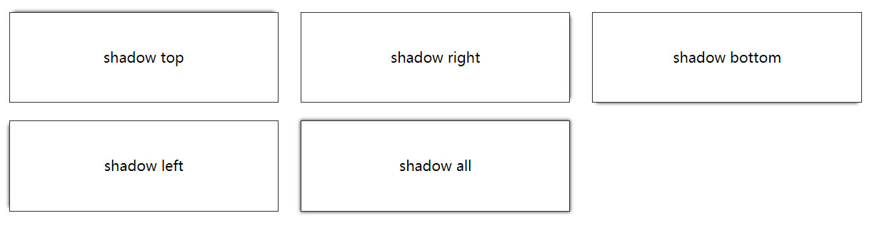
四个边框阴影
2
3
box-shadow: 0 0 5px #333;
}
上边框阴影
2
3
box-shadow: 0 -5px 5px -5px #333;
}
右边框阴影
2
3
box-shadow: 5px 0 5px -5px #333;
}
下边框阴影
2
3
box-shadow: 0 5px 5px -5px #333;
}
左边框阴影
2
3
box-shadow: -5px 0 5px -5px #333;
}
border-radius
border-radius跟margin类似,可以只定义一个属性代表四个圆角的半径,也可以分开定义,顺序为左上角、右上角、右下角、左下角。或者
- border-top-left-radius
- border-top-right-radius
- border-bottom-right-radius
- border-bottom-left-radius
如果border-radius只定义了2到4个属性,则跟margin有区别,如果对角没有定义,则样式应用于对角,具体规则见下:
1 | border-radius: radius |